Data Needs Among ICU Nurse Managers

An exploratory study aimed at discovering how and why nurse managers of hospital intensive care units (ICUs) use data.
Context
Organization
Providence Health & Services (Providence) is one of the largest healthcare systems in the United States. As a mission-driven non-profit, it focuses on serving the most vulnerable populations with care. With over 122,000 healthcare providers in 51 hospitals and 1000 clinics, it has had millions of patient visits - and gathered massive amounts of data. Effective, user-centered internal data analytics tools were necessary for internal decision-makers to measure performance, guide strategy, and improve patient and business outcomes.
When I joined the newly formed analytics UX team, no research had yet been done to understand how healthcare providers used data, their needs and challenges, and their data practices. This study, therefore, was the first one aimed at understanding our users, problems, and opportunities for product development.
Goals
Business goal: Identify early opportunities to help nurse managers find analytics more easily.
Research goals: Understand ICU nurse managers' overall responsibilities and pain points, how and why they find and use data, and their key data needs and pain points.
Team
My role: Research lead
Stakeholders: Analytics director, product manager
Study Design
Method
I used in-depth interviews because I needed to be able to ask very open, broad questions and probe based on participants’ responses (i.e., I needed to go deep). Doing the interviews remotely enabled me to reach nurse managers across the hospital system quickly and economically. Plus, interviewing them on desktop would allow them to share their screens with me, so that I could see the kinds of data tools they used.
Sample
Eight ICU nurse managers. I balanced across demographic factors such as geographic region and hospital size. These individuals were nominated by the divisional nursing executives, which helped with buy-in and participation.
Tools
Microsoft Teams, Office Suite
Process
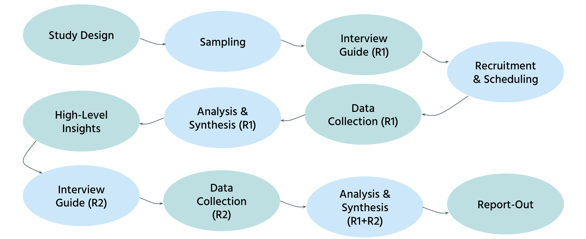
Uniquely, I conducted two rounds of in-depth interviewing. The first round of interviews was loosely structured and truly exploratory, because I did not know what participants would say (e.g., what kinds of data they looked at). In order to reach saturation and identify themes, I then conducted a second round of interviews focused on a discrete, limited set of topics across all participants. Both rounds focused on understanding both the users (e.g., roles, responsibilities, overall pain points) and their use of data (e.g., data tasks, sources, motivations, follow-up actions).
Key Insights
As the first study focused on our users, the study uncovered rich insights and details about ICU nurse managers' contexts, goals, and experiences with data. What follows is a summary of the key insights.
Key responsibilities and pain points
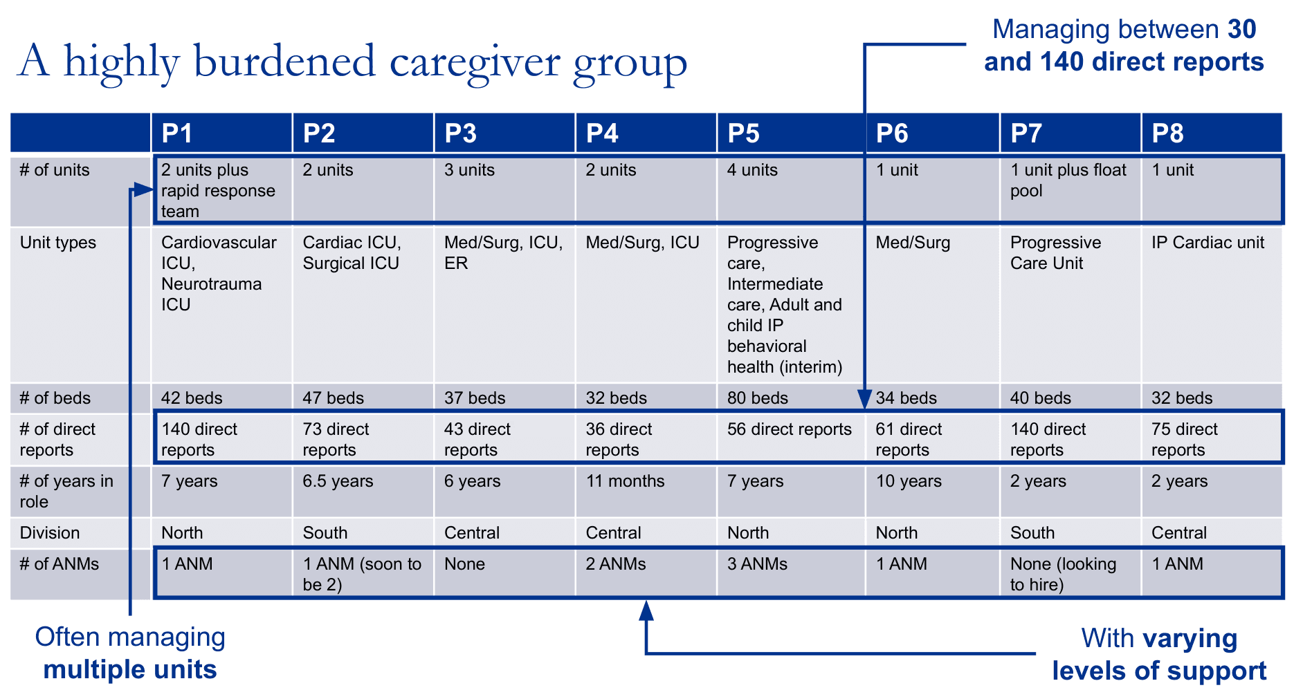
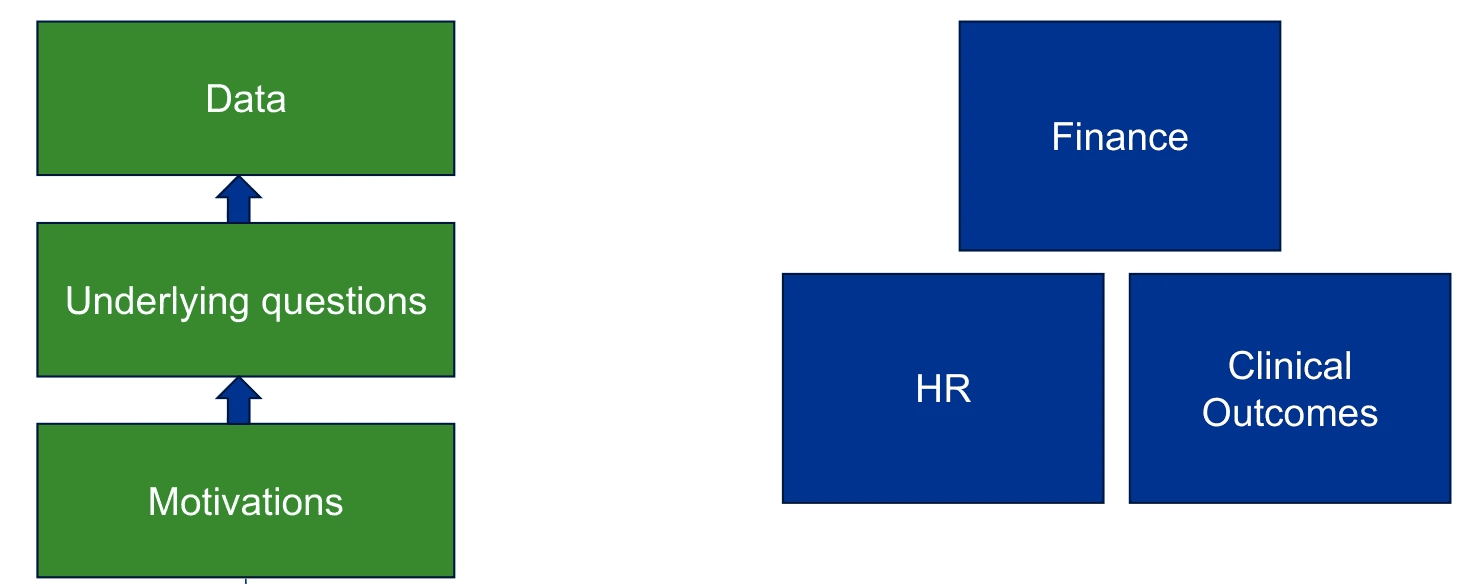
Critically, the study revealed just how burdened this caregiver group was. ICU nurse managers had a wide range of responsibilities, encompassing financial outcomes, clinical outcomes, and HR duties for their staff. They managed dozens of nurses (in one case, over a hundred) and often oversaw multiple intensive care units. The support available to them via administrative nurse managers (ANMs) varied; some had no administrative support, whereas others did. As a result, their biggest challenge was a lack of time. This was important context as we designed products that were often difficult to discover and use (see later insights).
"I would love to get back out on the floor... I rarely can get out and round on my caregivers anymore or patients… I'm a nurse. I went to nursing school to take care of people."
“I'm just keeping my head above water... It doesn’t leave a lot of space for creativity or expansion of the role. And there are a lot of things I would like to be doing that I'm not doing, because I just don't have the time."
Where data fit in
Key data questions were related to financial health (e.g., staffing efficiency), patient care quality (e.g., preventable negative outcomes), and team health (e.g., staff turnover). Nurse managers sought to ensure their units stayed within budget, provided the best quality patient welfare possible, maintained compliance with regulations, and maintained staff welfare and retention.
“If we are not careful with our productivity and we have more staff than we need, then we’re going to spend more money than we need to be spending and it’s going to hurt the hospital.”
"We should never have a urinary tract infection due to an indwelling catheter. It is harm. Our metric boards have a statement on there about how we're on a journey to zero harm.”
Actions driven by data
Most use cases for data were retrospective (i.e., root cause analysis and follow-up). Nurse managers generally had less time to use data proactively to mitigate risk and prevent negative outcomes ahead of time. Participants used data to improve processes and protocols (for decisions in which they had direct control) and to influence and motivate others (where decision-making was shared). At times, they verified data accuracy before acting further.
“It's really valuable for nurses to see that [data], so they know the interventions that they're doing make a difference… They have so many things to do, they don’t want to waste their time on tasks that aren't making a difference or things that aren't meaningful."
“Sharing the data on falls for me is important because I want to make sure we're keeping patients safe, and we have a lot of interventions that we can do with alarms, moving patients closer to the nursing station…"
Data sources
Dashboard use was limited, with participants struggling to find and use analytics tools on their own. Few participants had been able to independently find data beyond what was provided to them. Instead, they relied on manual tracking methods, information shared by their team and other teams, and canned reports.
“I don't know how to access any data on my own. I usually know who to ask if I want it, but I don't know how to access it myself."
Analytics pain points
Several key pain points combined to make it difficult to effectively leverage data to inform decision-making.
Data was difficult to find.
Nurse managers did not know where to look for data (and did not have time to explore). In fact, data was spread across multiple platforms, making it hard to remember which platform to use for which types of questions. In the end, participants relied on long lists of bookmarked links, but when a link stopped working (e.g., new URL), they were at a loss. At times, they relied on a single POC for data, which made them vulnerable when that person was away or when roles were eliminated.
“I wouldn't know where to go to find some of the data. Which I do think is a challenge because I can't go in and see my ventilator usage in my unit for the year. I don't know how to find that information or where to find it…”
"We were receiving data from somebody in administration… But that person is on a leave of absence right now, for an unknown amount of time… So we haven't had access to any of the data for two months now."
Data was difficult to understand.
Dashboards and reports provided an overwhelming amount of information that nurse managers did not have time to sit down and pore through. Beyond that, data was often presented in unintuitive formats (e.g., absolute numbers vs. ratios), making it difficult to comprehend and share effectively with their teams.
“There's just too much data. I need somebody to just feed me the information that I need - the information that I can walk out of my office with and walk out there to my caregivers and say, 'This is what we need to fix.' But until I can identify it, I can't really expect them to identify it.”
“I've just started manually tracking in real time... Because when we get data... it's per thousand patient days, which, if I'm trying to share with my caregivers what that means as far as raw numbers, they don't understand what 'per thousand patient days' means. So I've just started tracking the whole number of 'We affected 2 patients with central line infections in the last 12 months.’"
Data was not relevant enough and/or lacked important context.
For example, data was sometimes too broad and not specific enough to answer their questions. At other times, data was incomplete (e.g., covering only one of their units). Delays in reporting also reduced the relevance of data, as did the inclusion of factors that they had little control over. Furthermore, even with relevant data, participants needed key contextual details to understand the full picture, and these details were often missing from dashboards and reports.
"There's a lot here that I don't know how to to apply, investigate, or change. And then there's some things here that I don't have control over, like my agency use or even my overtime (in regard to just being able to cover shifts)... I only have control over incidental overtime."
“I track [patient] falls in an effort to understand themes... You get your data here but it doesn't really tell you... what were the gaps? Were there interventions in place when the patient was at risk to fall or were there not interventions in place?...You don't get a lot of that from this data here on a dashboard."
Data tools were difficult to use.
Dashboards that were meant to be interactive were hampered by poor usability and large learning curves. It was often time-consuming to filter down to the level of data that nurse managers needed, and challenging to build custom reports without significant prior education. These challenges did not meet the needs of busy nurse managers who needed data but had little time to interact with tools to get it, and reinforced reliance on manual data tracking (or general impressions).
“If I could get it and not have to spend a lot of time filtering it down to things, it wouldn't be so bad, but there's too much data there… and we have to filter it down and filter it down and filter it down. And then by then there's already been so many interruptions that you don't even remember what you were trying to find… It's just frustrating.”
“I don't track those items myself because I don't have time to track that manually, and so we go off of just generalized information or 'I'm hearing this or I'm seeing this, so this is what we need to work on'... With some of the areas, you're probably not getting the actual issues or fallouts."
Data accuracy was questioned.
Data was seen as only as good as its inputs, whether by human or by system. This prevented participants from immediately trusting data that they came across, in case it might be flawed.
“The first year turnaround data is not accurate… Let's say a caregiver has never even onboarded (they went through pre-boarding). They never even showed up to the unit for various reasons, and that automatically counts against you, even though they've never started. So when you look at that first year turnaround turnover, I just validate, ‘Well, that person didn't even start.’ So I have my own manual lists, just so I can speak to it.”
Recommendations
Product Design
Based on the findings, I recommended the following guidelines for our data products:
Ensure users can easily find data.
Advertise support resources that users can contact for help in finding, understanding, or trusting data.
Present information simply and clearly. Prioritize the key points most relevant to the user, rather than presenting upfront all the data that is available.
Help users assess upfront (using clear, non-technical terms) whether a given dashboard or report will be able to answer their questions (e.g., scope, filters, etc.).
Ensure it is fast and easy, suitable to multiple interruptions, for users to filter data to meet their needs.
Advertise and offer multiple levels of education, including in-depth tailored education on finding and building reports.
Try to understand users’ needs one level deeper. Anticipate and support users’ natural next steps (e.g., easily find related contextual information).
Strategy & Research
The scope and complexity of this study underscored the need for clearer strategic priorities. I suggested several factors we could use in prioritization, including:
Role (e.g., nursing vs. operations vs. medical)
Decision type (e.g., financial vs. clinical)
Use case (e.g., retrospective root-cause analytics vs. prospective risk mitigation)
Platform
The study also generated more opportunities for research, such as understanding how well the needs and challenges of nurse managers generalized to other user groups (e.g., individual nurses, doctors, quality personnel, etc.) and settings (e.g., non-acute).
Impact
As the first exploration of user experiences with our products, this study had multiple levels of impact:
Revealed underlying user needs behind data questions.
Put products in context of users' broader responsibilities and challenges.
Evangelized UX research in a new-to-UX team.
Built empathy for users dealing with life-and-death situations on a daily basis.
Laid the foundation for future insights, such as this study.
Gave teams a starting point for UX best practices for dashboard design.